Nothing quite pulls a space together like coordinating trim.
Deciding on a neutral or color, and which color, and which hue of that color, can get a little overwhelming.
Here are a few tips to make it easy:
- Rich tones are in, but that doesn’t have to mean Victorian-era dark saturation. Modern rich tones can be a little more subdued, but just as robust – even neutrals such as Balanced Beige by Sherwin-Williams, a true balance between cool and warm.
- While neutrals are always an option, and highlight architectural styles like molding, color adds interest and a layer of sophistication. For bolder hues, the trim color should match something in the existing elements like wallpaper, curtains or a spot of color on a rug. This makes the overall design cohesive.
- When choosing paint finish, high gloss is considered to make the most impact – if you want a more dramatic look. I tend to reserve high gloss for high traffic areas.
Need help with trim color, but don’t know where to start? Ping me @info@lilacdustcolor.com. Chatting is free. Work with me, and you’ll enjoy my Sherwin-Williams PRO+, Wayfair Pro Designer, and Decorator’s Best fabric and wallpaper Trade Program designer discounts.
Now available: Check out our new collection of Decorative Elements, for inspiration! Also – photos of our first commercial office space refresh in classy Sherwin-Williams neutrals. (Virtual Consulting) and a new River Condo refresh (Virtual Consulting) in Sherwin-Williams’ classic Snowbound, featuring all new paint, furniture and décor.
Follow Lilac Dust Design & Color Consulting LLC @lilacdustcolor on IG, LinkedIn, Yelp for Business and FB, for decorating tips and updates on industry trends.
Sign up for our mailing list on our homepage. Have a question or comment? Email me at info@lilacdustcolor.com.
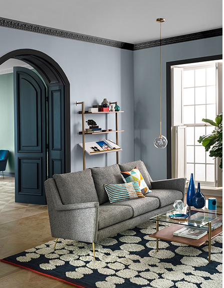
Image courtesy of Sherwin-Williams. #sherwin-williams
Paint colors are Sherwin-Williams Cascades SW 7623 and Black Magic SW 6991.